

Biotic Ferments
FULL WEBSITE REDESIGN | BRAND REFRESH

Squarespace redesign for a craft beverage brand.
CASE STUDY: BIOTIC FERMENTS
A West Coast beverage brand had a bold new identity but a website that didn't reflect it. They wanted their new website to serve the people who mattered most: retail buyers and customers looking to learn more before they buy.
1.4K
VISITS IN THE
FIRST SIX WEEKS
7
PAGES
REDESIGNED
2
PRODUCT LINES
UNIFIED
0
GENERIC
TEMPLATES USED
THE PROBLEM
The brand was ready. The website was ready to catch up.
“This is not a simple visual refresh. We're looking for someone who can improve UX and information architecture, strengthen messaging hierarchy, and provide structural recommendations aligned with brand positioning.” - Ryan Johnston-CEO of Biotic Ferments
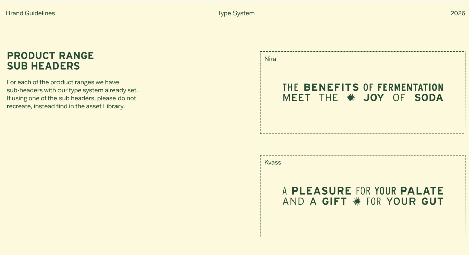
Biotic Ferments had just completed a full brand refresh with sharp typography, a distinct visual system across their two product lines (Kvass and Nira), strong certifications. The work was done. But their existing website was still living in the old brand, built before the new brand direction was in place.
Beyond the visual update, the brief called for a structural rethink. Biotic doesn't sell direct so the site functions primarily as a brand platform for two key audiences: retail buyers evaluating them for resale in their stores, and customers looking to learn more about their products before they buy. The structure needed to serve both.

STRATEGIC THINKING
Before any design — a site audit.
The brief called for strategic thinking, not just execution. So before touching a single page, I ran a dedicated audit and met with the CEO to understand the business, map out what was and wasn't working, and align on a clear direction.
A few things came into focus right away:
The navigation needed simplifying. Too many navigation options, not enough clarity. I streamlined the structure so visitors feel guided, not lost.
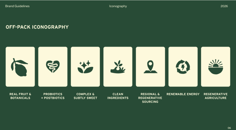
The messaging hierarchy wasn't doing its job. Biotic's biggest trust signals
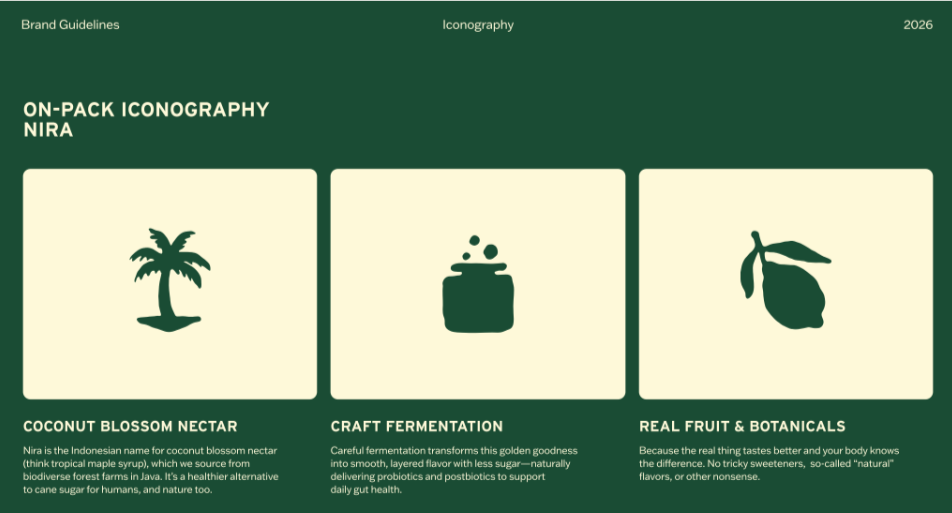
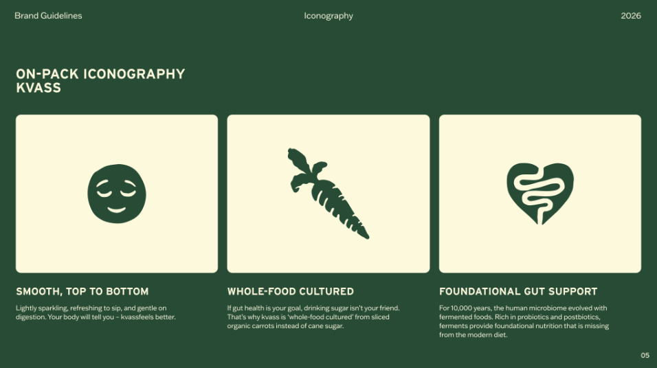
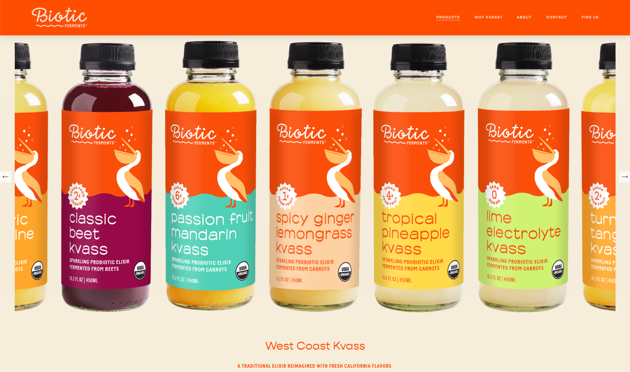
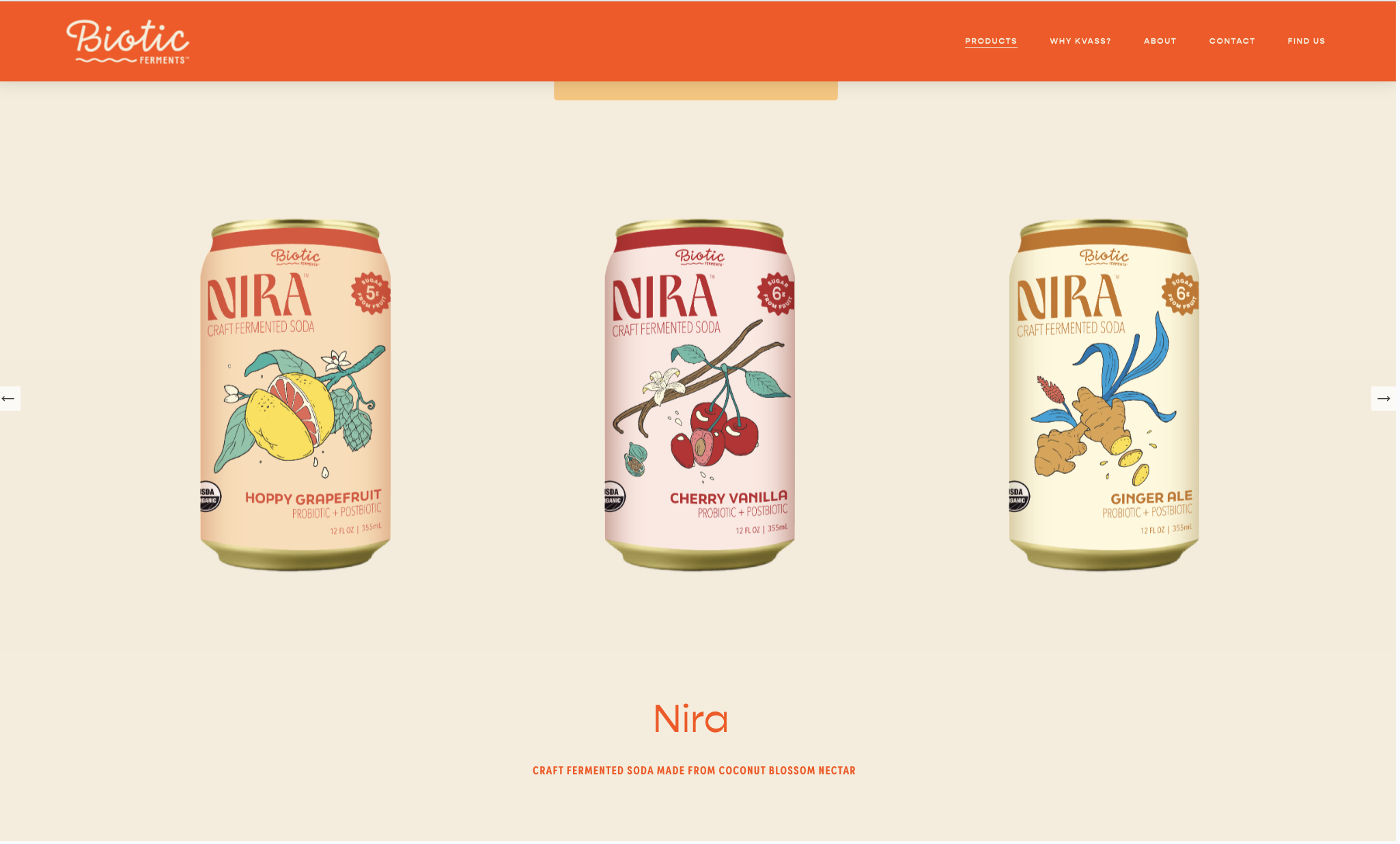
(B Corp, USDA Organic, Stanford-backed science) were scattered as afterthoughts. We moved them front and center where they actually build confidence.Their two product lines were getting lost together. Kvass and Nira have different stories and different audiences. Giving each its own space lets visitors actually connect with what they came for.
The brand voice wasn't coming through. Biotic's brand voice is bold and opinionated, but the previous layout didn't yet have the room to reflect it. The redesign let that personality come through in type, spacing, and flow.
Mobile needed real attention. Buyers and customers are both browsing on their phones. Mobile spacing, readability, and hierarchy were redesigned as a primary experience
DESIGN DECISIONS
Because the website functions as a credibility and educational platform rather than a direct sales tool, every decision prioritized clarity, trust, and flow over pushing people toward a transaction. The goal was to make visitors feel immediately confident in the brand.
What changed — and why.
Structure
Simplified navigation and page structure
Reduced options, clarified the path. Visitors now move through the site intuitively. No guessing, no overwhelm. Each page has one clear purpose.Messaging
Moved trust signals to the front
B Corp, USDA Organic, Stanford science, 20+ years of expertise all moved from scattered footnotes to prominent, early placements where they actually shape first impressions.Brand
Translated the brand book into a living digital experience
The new brand identity used bold, editorial type as a design element. I brought that directly into the web layout so the site feels as intentional as the brand itself.Architecture
Gave each beverage their own space
Each product line now has its own visual identity and story within the unified brand that is distinct enough to connect, cohesive enough to feel like one brand.Mobile
Designed for how people actually browse
Mobile wasn't an afterthought. Spacing, font sizes, hierarchy, and tap targets were all refined so the experience feels just as polished on a phone as it does on desktop.Technical
Protected SEO through the full rebrand
A visual overhaul can quietly undo years of search rankings if the technical side isn't handled carefully. URL structure and metadata were preserved and improved throughout.
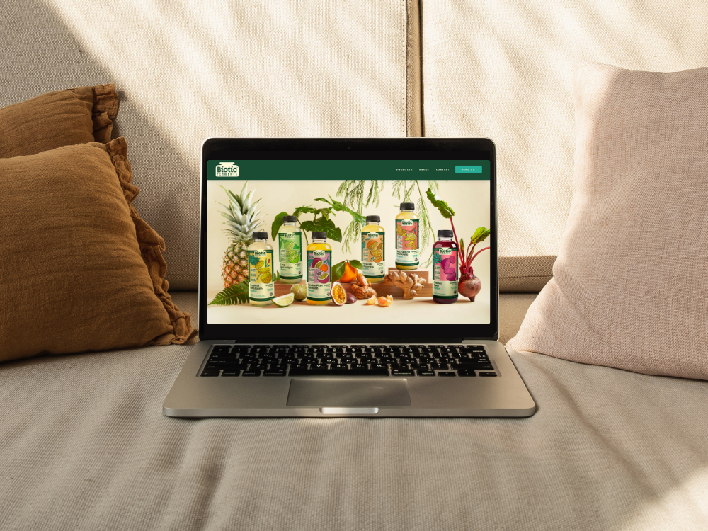
BEFORE/AFTER
Not just a new look — a new experience.
The visual changes are obvious. But the more important shift is structural, what visitors see first, what guides them through the page, and what makes them feel confident in the brand before they've read a single word.
BEFORE
Competing hierarchy. Multiple elements fighting for attention, old branding, no clear signal of where to look or what to do next.
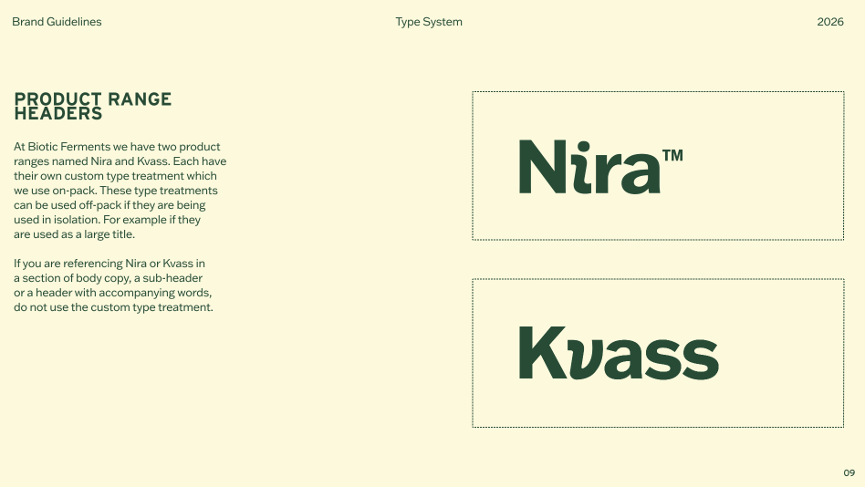
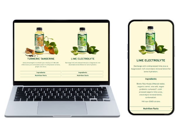
Previously, Kvass and Nira shared the same layout. Kvass and Nira shared the same layout, diluting what made each product line distinct.
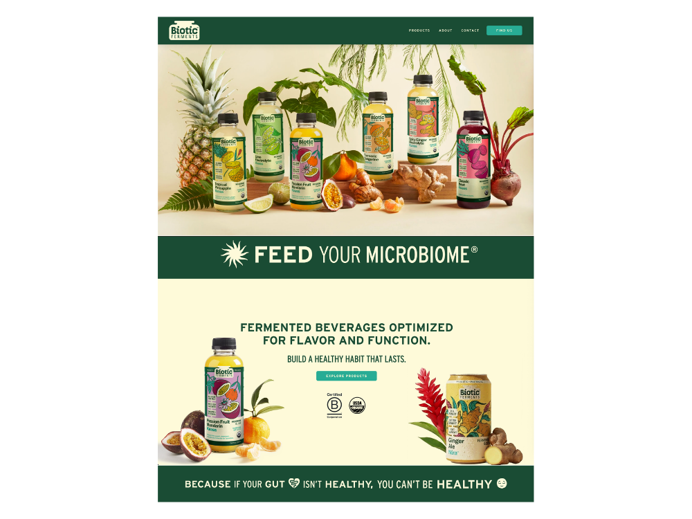
AFTER
Simplified visual flow. Brand credibility leads, trust signals are visible immediately, and the page guides visitors naturally toward what matters.
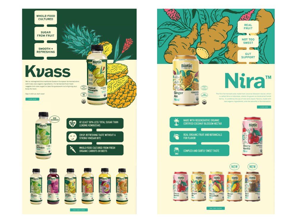
Each line, its own story. Kvass and Nira now have distinct visual templates so visitors can actually connect with the product they're exploring.
Within the first six weeks of launch, the site saw over 1,400 visits, strong early traction for a brand platform that wasn't trying to go viral, just convert the right people.
Beyond the numbers, the site now does what it was always supposed to: it looks and feels like a brand ready for national retail. The navigation is clear, the hierarchy guides visitors naturally, and the identity comes through on every page, desktop and mobile alike.
Most importantly, it gives Biotic Ferments a foundation that can grow with them, scalable structure, clean templates, and a digital presence that reflects the quality of what they're building.
A website that actually works for where the business is headed.
OUTCOME
Ready to elevate your brand?
Take the next step toward a more intentional design presence.